http://www.aa.com/newamerican/
Must say I'm not impressed. The AA brand is a legendary aviation icon.


AA Reveals New Livery
Started by
Iain_
, Jan 17 2013 11:02 AM
30 replies to this topic
#2
Iain_
-
- Members
-

- 3,424 posts
Airline Transport Pilot
Posted 17 January 2013 - 11:34 AM
Forgot the pic:
#3
_NW_
-

- Members
-
- 8,119 posts
Orville Reincarnate
- Location:KSAT
Posted 17 January 2013 - 12:15 PM
Dunno if anyone will be able to see this since it's a FB photo.. but my opinion? The scheme is awful. The logo is nice though.

#4
Iain_
-
- Members
-
- 3,424 posts
Airline Transport Pilot
Posted 17 January 2013 - 01:12 PM
Displays fine for me. Tail is the worst part.
#5
03SVTCobra
-

- Members
-
- 2,698 posts
Airline Transport Pilot
- Location:Dallas, Tx
#6
Dano
-

- Members
-
- 815 posts
Private Pilot - IFR
- Location:World Traveler
Posted 17 January 2013 - 01:12 PM
I personally like it.
#7
03SVTCobra
-
- Members
-
- 2,698 posts
Airline Transport Pilot
- Location:Dallas, Tx
Posted 17 January 2013 - 01:14 PM
Ill start on a paint for the ifly later. I'm from DFW and have flown wn or aa my entire life it will be sad to see them go this route but I get it. The planes just look and feel old, even a brand new 737 I flew to miami on last month with 21 hours on the frame according to the FO. They will start interior overhauls soon ive heard as well.
Edited by 03SVTCobra, 17 January 2013 - 01:18 PM.
#8
Mumbles
-

- Members
-
- 964 posts
Private Pilot - IFR
- Location:KRNO
Posted 17 January 2013 - 01:26 PM
That is horribad. I get they wanted to modernize the look, but they could have done much better than this. What a shame.
#9
Chief_Bean
-

- Members
-
- 15,351 posts
Cruising at FL150
- Location:London
Posted 17 January 2013 - 01:34 PM
Gosh, it's horrific. Looks cheap.
#10
Jonay
-
- Members
-
- 2,490 posts
Airline Transport Pilot
- Location:Alba
Posted 17 January 2013 - 01:47 PM
Note Indy's lack of comment! 
It looks alright. But I preffered the AA logo.
It looks alright. But I preffered the AA logo.
#11
Andrewsarchus
-

- Members
-
- 2,217 posts
Airline Transport Pilot
- Location:Wirral, England
Posted 17 January 2013 - 01:53 PM
Propper tacky... That tail is something else.
#12
LA_PHX
-

- Members
-
- 5,783 posts
Orville Reincarnate
Posted 17 January 2013 - 01:56 PM
Holy crap...they've had the current logo since the 60s? 
My thoughts:
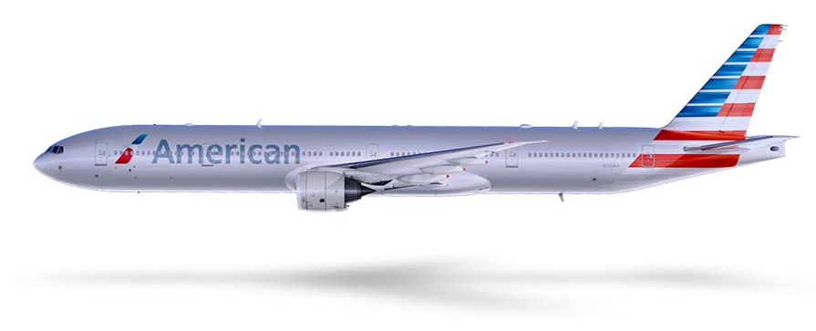
1. Overall, could have been better, and this still doesn't portray the modernity that other airlines have with their liveries.
2. Love the new logo, really do.
3. Don't really understand why the fuselage is the shade of grey it is - for me, it doesn't blend well with the other elements.
4. The title "American" looks strange. The grey fuselage, combined with the windows, combined with the text which seems to have some grey in it, it just looks bad.
5. The tail paint I think is something else that could have been better but I still quite like it. Definitely nicer than the old "AA".
My thoughts:
1. Overall, could have been better, and this still doesn't portray the modernity that other airlines have with their liveries.
2. Love the new logo, really do.
3. Don't really understand why the fuselage is the shade of grey it is - for me, it doesn't blend well with the other elements.
4. The title "American" looks strange. The grey fuselage, combined with the windows, combined with the text which seems to have some grey in it, it just looks bad.
5. The tail paint I think is something else that could have been better but I still quite like it. Definitely nicer than the old "AA".
Edited by LA_PHX, 17 January 2013 - 01:57 PM.
#13
LA_PHX
-
- Members
-
- 5,783 posts
Orville Reincarnate
Posted 17 January 2013 - 02:20 PM
Someone over at A.net made a good point:
Posted by commavia @ http://www.airliners...d.main/5663994/
Quote
The more I think about it and let the images roll over in my mind, the more I agree with you guys. The expectations here were immense, and the task basically impossible - there was no way they could come up with anything that wasn't going to disappoint a lot of people. When you're contemplating replacing the oldest brand in the industry, and one of the most iconic brands anywhere, you're bound to upset people.
Posted by commavia @ http://www.airliners...d.main/5663994/
#14
Romario_
-

- Members
-
- 1,257 posts
Commercial Pilot
- Location:Miami.
Posted 17 January 2013 - 04:02 PM
Somehow I just do not connect American Airlines with that livery. Sounds dumb, but I guess I've been just used to the current livery for so long
#15
_TW_
-
- Moderator
-
- 8,474 posts
First Class Member\Screenshot Hotshot of 2004
- Location:Baden-Baden, Germany
Posted 17 January 2013 - 04:13 PM
To me, it was time for a change, and personally, I quite like the new livery.
Liked the T7 in this promo video -
http://www.aa.com/newamerican
Liked the T7 in this promo video -
http://www.aa.com/newamerican
#16
MikeySM
-

- Members
-
- 527 posts
Private Pilot - IFR
- Location:Durham Tees-EGNV
Posted 17 January 2013 - 04:31 PM
I wonder if they will convert to Airbus now they don't have to worry about them being so shiny
#17
_NW_
-
- Members
-
- 8,119 posts
Orville Reincarnate
- Location:KSAT
Posted 17 January 2013 - 04:42 PM
 Chief_Bean, on 17 January 2013 - 01:34 PM, said:
Gosh, it's horrific. Looks cheap.
Oh, well then since this is America, it should fit right in!

#18
LA_PHX
-
- Members
-
- 5,783 posts
Orville Reincarnate
Posted 17 January 2013 - 06:09 PM
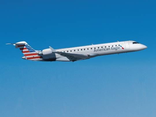
This article explains a little bit behind some of the design choices. I think it looks fantastic for American Eagle, still not my favorite on the mainline aircraft but I'm sure it will grow on me.
http://www.usatoday....w-look/1841591/
Quote
American Airlines is rolling out a new look for its aircraft, marking the first fleetwide change to its aircraft exteriors since 1968.
The changes �" which also includes a new company logo �" bring a dramatically different look to American's planes, which for decades have been easy to identify by their simple, classic logos and polished metal exteriors.
American says it had to come up with a new "livery" for its plane exteriors as it begins to take delivery of recently ordered new-age jets that include composite materials �" materials that cannot be polished as the airline's existing aluminum fuselages are.
"Since the polished metal look was no longer an option, the importance of the paint selection became critical to honoring American's silver bird legacy," American says in a release highlighting its new look. "Silver mica paint was chosen as a way to maintain the silver heritage which American's people and customers are passionate about, yet progress ahead with a clean new look."
The move also comes as big changes are afoot at American parent AMR, which is considering a merger with US Airways while it restructures under Chapter 11 bankruptcy protection.
"While we complete the evaluation of whether a merger can build on American's strengths, we remain steadfast in each step we take to renew our airline, a step we take with great respect for our name American," American CEO Tom Horton says in the release. "Today marks important progress in that journey as we unveil a new and updated look for the first time in more than 40 years."
American also will extend its new look to its regional affiliate American Eagle.
http://www.usatoday....w-look/1841591/
#19
Mumbles
-
- Members
-
- 964 posts
Private Pilot - IFR
- Location:KRNO
Posted 17 January 2013 - 09:24 PM
Oh we are talking about American.
#20
UnitedGuy
-

- Members
-
- 162 posts
Private Pilot - VFR
- Location:Cabot, Arkansas, USA
Posted 17 January 2013 - 09:59 PM
Well, here's my take on the livery:
With the US Airways-American merger looking more and more imminent with each passing day, the time for a new livery is now. Sure, I love the bare metal. It's a classic. But, I don't think that the bare metal would look good on the Airbuses they'd inherit from US Airways (as well as the ones they have on order). Heck, when United went to the globe livery, I wasn't too crazy about it at first. Now, it has grown on me quite a bit, and I love it! Just like I miss the Tulip, I'll miss the Eagle. But, now is the time for a new American livery, and IMHO, the new livery is fantastic!
Now, I shall anticipate when I finally introduce the livery into my FS


